When was the last time you checked your website on mobile ecommerce?
Did you know approx. 70% of traffic to your website is coming from a mobile device? but if you look at the conversion rate, it’s nearly half that of your desktop…. at around 1%.
With the majority of internet traffic coming from mobile devices, it’s more important than ever for retailers to have a mobile-friendly website.
What this says to me is that your customers want to buy, but the mobile experience is sooooooo bad.
Your customer has to jump onto the desktop to complete their journey, and in the process, you are losing a lot of customers and revenue!
As humans, we are easily distracted.
Maybe they didn’t need those shoes after all,
Maybe they saw a competing product and went elsewhere,
OR maybe the dog screamed, the cat barked, and the kid meowed,
and they got distracted and totally forgot about shoes (that never happens to me 🤣).
The Consequences of Not Being Mobile- Ecommerce -Friendly
A non-mobile-friendly website can have several negative consequences for retailers, including:
Poor User Experience: A website that is not optimized for mobile devices can be difficult to navigate and read, leading to a poor user experience.
Decreased Visibility: Google favors mobile-friendly websites and prioritizes them in search results, meaning that a non-mobile-friendly website may be pushed down in search rankings and become less visible to potential customers.
High Bounce Rates: A non-mobile-friendly website may have a high bounce rate, as visitors are more likely to leave a website that is difficult to navigate or read on their mobile device.
Why Ignoring Mobile-Friendliness Could Be Killing Your Traffic and Sales?
Ignoring the importance of mobile-friendliness could have a serious impact on your traffic and sales. With more and more people using their mobile devices to browse the internet, having a non-mobile-friendly website can mean missing out on a large portion of potential customers. This is particularly true for ecommerce retailers, as customers are increasingly using their mobile devices to shop online.
In addition to losing potential customers, a non-mobile-friendly website can also negatively impact your search engine rankings, making it even harder for potential customers to find your website.
So mobile ecommerce is killing your sales......
Here are three things you can do today to fix it!
1. Check your Google Analytics – to if your mobile experience is killing your sales
Go to google analytics, > Audience > Mobile. In GA4 just type “tech overview”. It will give you a summary of your mobile traffic
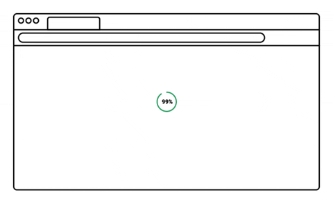
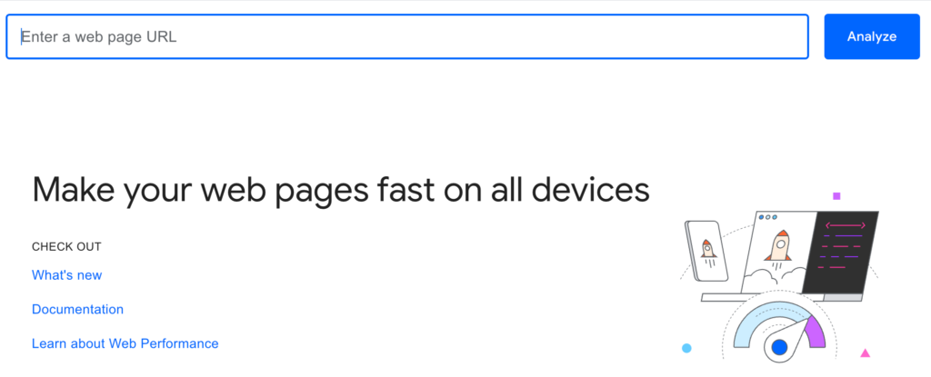
2. Check your Mobile speed- A slow-loading website can lead to high bounce rates and low dwell time, negatively impacting your website’s ranking.
Use Google’s PageSpeed Insights to measure your website’s speed and make improvements. If it is slow and you get the dreaded big red circle… then try compressing your images and remove any plugins you are not using.
3. Walk through your customer journey on mobile…
Go through your user experience on your mobile. Identify what’s working and what’s not and fix it. Often your website looks totally different on mobile.
Benefits of having mobile ecommerce friendly website
Improved User Experience: A mobile-friendly website is optimized for smaller screens and touch-based navigation, making it easier for users to navigate and interact with the website.
Increased Traffic: With the majority of internet traffic coming from mobile devices, having a mobile-friendly website can increase your website’s visibility and attract more visitors.
Higher Search Engine Rankings: Google favors mobile-friendly websites and prioritizes them in search results, meaning that a mobile-friendly website can improve your search engine rankings.
Lower Bounce Rates: A mobile-friendly website can lead to lower bounce rates, as visitors are more likely to stay on a website that is easy to navigate and read on their mobile device.
Improved Conversion Rates: A mobile-friendly website can improve conversion rates, as visitors are more likely to make a purchase or take an action on a website that is optimized for their device.
Competitive Advantage: With more and more businesses optimizing their websites for mobile devices, having a mobile-friendly website can give you a competitive advantage and help you stand out from the crowd.
Cost-Effective: Making your website mobile-friendly doesn’t have to be expensive. With responsive design and other mobile-friendly technologies, you can make your website mobile-friendly without breaking the bank.
Having a mobile ecommerce friendly website is essential for retailers looking to maximize their traffic and sales. A non-mobile-friendly website can have serious negative consequences, including a poor user experience, decreased visibility, and high bounce rates. By testing your website’s mobile-friendliness and taking steps to make it more mobile-friendly, you can ensure that your website is accessible to the growing number of mobile users and stay ahead of the competition.
Book a 15 min free website review with an ecommerce coach to get expert advice on optimizing your website for increased traffic and sales. This is a great opportunity to get personalized feedback and actionable insights on improving your online store. Don’t miss out on this valuable resource!
BIO
Kelly Slessor, is an Ecommerce Coach and a digital marketing expert. Passionate about retail, hospitality and retail service providers. As the founder and CEO of Shop You, an AI powered personalised virtual shopping mall she has spent 20 years building retail technology that responds to customer needs, drives conversions and increases revenue. Over the past year she has worked with over 1000 retailers and hospitality providers. If you want discover more about digital growth and optimisation, work with me.